How to make portfolio Graphic specifications
Page Templates.
 |
| (http://www.os-templates.com/page-templates/portfolio-18) |
The purpose of page templates is to give you the chance to
develop your ideas first you should sketch out the layout of the front page,
this page should have a creative design that reflects you in such a way that
would make people want to see what was inside of your portfolio. The
introduction page, this should have some information about you within it,
things included in this should be things such as your name, contact details (such
as email address or telephone number) and should also include a short
explanation of everything included within the portfolio. The inspiration page
should be a collage or as it’s referred to in the media industry a mood board,
the mood board should have everything that inspires you as a creative person
included within it so that a viewer of your portfolio can see everything that
makes you the creative person you are. The page template for each piece of work
should have a consistent theme and design. Each page should show the best
pieces of work which you have designed or created, the reason all this should
be done is to show off your skills and abilities as this is such a competitive
industry you need to make people want to see your work and leave them wanting
more.
File formats/ printing.
The reason why file formats are important within a portfolio
is because it ties in with printing, when printing I would recommend setting
the dots per inch (DPI) at 300, and always set the colour mode to CMYK (cyan
magenta yellow and black) this is the mode in which printers print colours
correctly the reason I would set the DPI to 300 is because it allows for finer
detail in printing giving the maximum quality and when creating a portfolio you
want everything to look as nice as possible, avoiding distortion is incredibly
important as if something is distorted within your portfolio it will look
unprofessional and the viewer may just walk away without even viewing your work
simply because of distortion in your work. File formats are important too for
example saving a photo as a PNG makes it a lossless image as I previously
mentioned in the previous posts lossless means all the detail is stored within
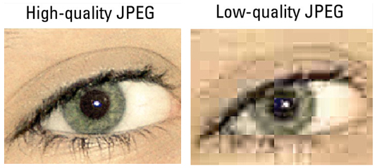
the image and it loses no detail and no information however a high quality JPEG
will if printed in CMYK and at 300 DPI will look just as good and will be
easier to store and transfer on a computer.
Saving.
 |
| (http://www.homeandlearn.co.uk/word2007_2010/images/multiDoc/download_file_1A.gif) |
Saving is always
important in work especially when designing the portfolio and the content of
the portfolio, the reason for this is because you do not want to lose anything
you may have designed, an easier way to save is to use the keyboard short cut (CTRL/S) this will save your quickly and effectively.
Audience Needs.
The audience needs for the portfolio should be one of your
main focuses the language within it should be easy to read however it should be
professional terminology and definitely shouldn't include slang, the reason for
this is that you want to set a positive professional example of yourself words
are as important as the actual pieces you have captured created or designed.
Visual style
Visual style is important to the portfolio it is everything
that is needed to make your portfolio stand out above everyone else’s, colour theory
is important colours you choose should reflect what kind of person you are, for
example blue is a colour that is liked by both males and females it shows you
are kind and trustworthy, these traits could be important to a person who wants
to hire you, and having these colours in your portfolio could make or break the
interest of a person, Alignment is also very important you are meant to be
professional so make sure to use guides and rulers to make sure everything is
aligned if something isn't straight when its meant to be this could lose you
someone who is interested in your portfolio, gestalt theory which is the theory
of shapes shows people what to do, for example arrows lead to the next page
these are important as they could indicate that some work continues on the next
page. Typefaces this is the type of font you use serif which are the fonts with
flicks at the ends of letters or sans serif which are the straight edged fonts. More detailed things include the law of continuity this is important as every page needs to look the same with the layout the reason for this is that if something has moved even a centimetre on one page to the next it could be noticed and be seen as unprofessional and remember in the media industry being professional is what really counts, an example of this is if a curve is on a page and it splits off in 2 paths our eyes will adjust to follow the smoothest path.
 |
| (http://0.tqn.com/d/psychology/1/0/C/1/continuity.jpg) |